Showing posts with label themecustomizer. Show all posts

The Client side aggreagation theme works in IE 8 and Firefox 3.5

One of the major problem with the WPS 6.1 was that it ships with Dojo 1.1 and since Dojo 1.1 does not work with Internet Explorer 8 or Mozilla's Firefox 3.5, If you tried using the client side aggregation (CSA) theme it use to throw the this browser is not supported error and it use to automatically switch the theme to Server side aggregation (SSA) theme.

Starting with WPS 6.1.5 the Portal ships Dojo 1.3.2 version and as a result the CSA theme works in both Internet Explorer 8.0 and Mozilla Firefox 3.5


As you can see i am using Firefox 3.5.5 (3.6 beta) and you can see that i am using a CSA theme and portal is making call ATOM service to get parts of the theme.


This is my screen shot of Client side aggregation theme being used in Internet Explorer 8 and as you can see i dont have to switch to the compatibility mode (IE 8 has concept of compatibility mode, if the website that your accessing is not compatible with IE 8 then you can switch into compatibility mode and IE 8 will behave like IE7)

Theme Customizer

Starting from Version 6.1, WPS provides a Theme Customizer portlet, that lets you change the appearance and behavior of a theme. You can select colors, fonts, graphics, turn areas of the page on and off, and adjust the settings for areas of the page such as the navigation. Customizations are saved as Theme Styles that are applied to pages by editing the page properties in the Manage Pages portlet. Some themes do not support all of the choices available in this portlet.

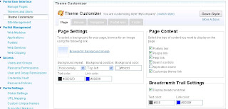
You can either edit the existing theme policy or add new theme policy using the Theme Customizer portlet. You can access Theme Customizer portlet from Portal Adminstartion Console like this


The Theme Customizer functionality is divided into 5 main parts.

  • Page: The page tab related functionality can be further subdivided into 3 parts

    1. Page Settings: Select the background image and/or background color for the page and decide how the background image should be displayed

    2. Page Content: Allows you to decide what content should be displayed on the page. Ex Show or hide the Search Control, Portlet Links,..etc

    3. Breadcrumb Trail Settings: Control if you want to display breadcrumb or not as well as look and feel of the bread crumb


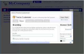
  • Banner: Lets you control the banner section of the portal page.

    1. Branding: Allows you to set company logo that displays in the top left hand side corner and the title for the Portal Site, as well as font and style for the Title text

    2. Banner Settings: Let you select the background image or color for banner area of the page. It also lets you decide if you want to display quick links in banner or not

  • Navigation: The Navigation part allows you to control Navigation both top and side level navigation of portal

    1. Navigation Style: This part allows you to choose what type of navigation do you want, side only or combination of side and top,..

    2. Top Level Style: Controls if you want to display top level navigation in the banner area or not, if yes then control look and feel of Top level navigation

    3. Side Navigation Style: Control look and feel of the side navigation bar


  • Portlet Area: This section lets you control the Portlet Area of the page.

    1. Portlet Area Header Settings: The header section is the area between banner and body which is rendered using screenRender tag. You can set image for that area and look and feel.Default portal theme does not show anything in this area

    2. Portlet Area Settings: You can set background image and background color for the mainContent section

    3. Default portlet skin settings: Controls the look and feel of the default portlet skin


  • Footer: Controls the footer of the portal page.

    1. Quick Links Shelf Settings: This section allows you to control if you want to display quick links shelf and if yes how.

    2. Footer quick links settings: Display quick links in footer or not and if yes how.


Once you start customizing the theme you will also get the Customize theme button in the banner of the page and when you click on it that will open a Theme Customizer portlet in modal dialog like this

Adding custom attribute to theme policy

Follow these steps if you want to add renderTestAttribute custom attribute to the theme policy

  • The root theme policy which is the first <policy> element node in the exported policies must have the renderTestAttribute attribute as well as lock attribute so add theme to theme policy like this.

    <policyValue
    Name="renderTestAttribute"
    Factory="com.ibm.wps.policy.parse.BooleanFactory">
    <value>true</value>
    </policyValue>
    <policyValue
    Name="renderTestAttributeLock"
    Factory="com.ibm.wps.policy.parse.BooleanFactory">
    <value>false</value>
    </policyValue>


  • By default every theme policy will inherit values from the root theme policy, so if you want a policy which requires different value of renderTestAttribute then true then add one attribute to that theme policy like this

    <policyValue
    Name="renderTestAttribute"
    Factory="com.ibm.wps.policy.parse.BooleanFactory">
    <value>false</value>
    </policyValue>


  • Inside your code you should use value of the renderTestAttribute to generate different content like this

    <% boolean isTestAttribute = themePolicy.getValueAsBoolean("renderTestAttribute", false);
    if(isTestAttribute){%>
    <p> Display this paragrah if renderTestAttribute is true. </p>
    <%}%>


Theme Policy

Theme policy allows you to control how a theme is rendered on a page. If you want two different versions of the theme one that needs bread crumb and other that does not then you can create a theme policy with isBreadCrumbRequired flag create two different theme policies one with value of this flag true and other with value equal to false and apply that policy correspondingly. You will also have to change your theme implementation i.e. jsp or .jspf pages so that it reads value of isBreadCrumbRequired flag from the ThemePolicy on the page and uses it display or hide bread crumb.

IBM's Server side as well as client side aggregation theme makes heavy use of Theme Policies. And portal ships ten different policies that you can use with IBM theme to control there look and feel

You can create a policy file using either the Theme Customizer portlet or open the existing theme policy in notepad modify it and import it into portal using XMLAccess.

You can apply theme policy to portlet using two options
XML Configuration Interface: Using the page metadata attribute com.ibm.portal.ThemePolicy
Properties Portlet: You can choose the Theme policy that you want to apply to the page from the Theme Style select box.
Theme policy is inherited so it only needs to be set on a page which requires a different policy than its parent.

A theme policy is made up of several attributes. Each attribute controls one aspect of the theme. For example, the Boolean renderBreadCrumb attribute controls whether the bread crumb will be displayed while the breadCrumbMaxLevels attribute controls the number of steps listed in the bread crumb when it is displayed.

You can look at all the theme policies that are installed on your server by exporting them using this xmlaccess script

<?xml version="1.0" encoding="UTF-8"?>
<request xsi:noNamespaceSchemaLocation="PortalConfig_1.4.xsd"
create-oids="true" type="export"
xmlns:xsi="http://www.w3.org/2001/XMLSchema-instance">

<portal action="locate">
<policy-node action="export" label="WebPage"
type="theme" path="">
<url>file:///c:/temp/exportThemePolicies.xml</url>
</policy-node>
</portal>
</request>

All the theme policies will be exported into c:/temp/exportThemePolicies.xml file.